 Middlesbrough Hub
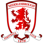
Middlesbrough's club crest has officially changed, with the club beginning their rebrand ahead of the new season on Wednesday. Boro unveiled the new club crest last October, with the plan to introduce it for the start of the 2026-27 campaign. The change came after fan consultation, and is part of the club's 150th anniversary celebrations next season. As such, a special gold version of the new club crest will be used throughout the upcoming campaign to mark the club's anniversary year, before the standard red version of the badge is used. Boro began the official role out of the new club crest on Wednesday, with digital platforms such as the club website, app and social media removing the old crest and replacing it with the new. Throughout the summer, work will be taking place around the Riverside and Rockcliffe Park to update signage, branding and other physical assets. The new club crest was designed by experienced graphic designer and Boro fan Andrew Patterson, with the input of over 4,000 supporters participating in club-run focus groups and consultations. A return to a more popular round badge, Andrew cleverly included many subtle details in the crest's design that represent the town and the club's history and heritage. That includes: the point at the top of the lion's body under the mane representing Roseberry Topping; the tongue being the aerial curve of the river Tees where the Riverside is; while the lettering on the crest is inspired by the steel industry of the area. Boro will soon unveil their kits for the upcoming campaign, with the special one-off gold version of the crest taking its place on the kits. Then, from 2027-28, the standard red version of the new crest will become the permanent new club crest in what Boro describe as 'the beginning of an exciting new chapter for the club'.
Club
Middlesbrough Unveils New Club Crest as 150th Anniversary Celebrations Begin
Middlesbrough's new club crest has been officially introduced, marking the beginning of the club's 150th anniversary celebrations. The new crest features a gold version, which will be used throughout the upcoming campaign.